Talk to the M&E lead at a mid-sized NGO in India, and you'll hear a familiar complaint: "We know we should have a dashboard. We just don't have anyone to build it." That's not a lack of ambition — it's an honest resourcing constraint. A dedicated data analyst is a luxury most organizations below a certain budget size can't justify, especially when the alternative is putting that salary line toward another field enumerator or a program officer. The result is one of two outcomes, both bad: the dashboard never gets built at all, and decisions get made off gut feel and the last field visit someone happened to take; or a well-meaning volunteer or intern builds one in Google Sheets, and it's accurate for exactly the week it was built, then quietly goes stale as nobody has time to refresh it.
The fix isn't hiring a data team. It's being disciplined about which metrics actually deserve automation, and choosing a data pipeline where "live" doesn't require anyone's ongoing manual effort.
Automate the handful of metrics that drive weekly decisions
The instinct when building a first dashboard is to put everything on it — every question from the form, every possible cut by district, every chart a stakeholder might someday ask for. That instinct is exactly backwards for a team without dedicated data capacity. A dashboard with forty tiles that nobody has time to maintain is worse than no dashboard, because it creates the appearance of monitoring without the substance, and it becomes stale first — the twelve most important tiles get forgotten under the weight of the other twenty-eight nobody looks at.
The right approach for a small M&E cell is to start with the smallest set of metrics that actually change what someone does that week. In practice, for most field data collection programs, that's a short list:
| Metric | What it tells you | Decision it drives |
|---|---|---|
| Total Submissions | Overall collection pace against target | Are we on track for the round deadline, or do we need to add field days |
| Active Forms | How many instruments are live in the field right now | Is an old or superseded form still collecting data by mistake |
| Team Members | Enumerators/supervisors currently active in the program | Is field capacity matched to the submission target this week |
| Flagged-Submission Rate | Share of submissions failing quality checks (GPS, duration, required fields) | Which enumerator or site needs a retraining call this week |
| Pending-Upload Backlog | Submissions captured offline but not yet synced | Is a device, a SIM, or a specific enumerator stuck without connectivity |
These five show up as the default tiles on FieldGovern's Org Admin dashboard — Total Submissions, Active Forms, Team Members, Flagged, and Pending Upload — alongside a Submissions Over Time chart and a Top Enumerators leaderboard. That's not a coincidence; it's the minimum viable set that a program manager without a data background can glance at every Monday morning and know, within thirty seconds, whether the week needs an intervention.
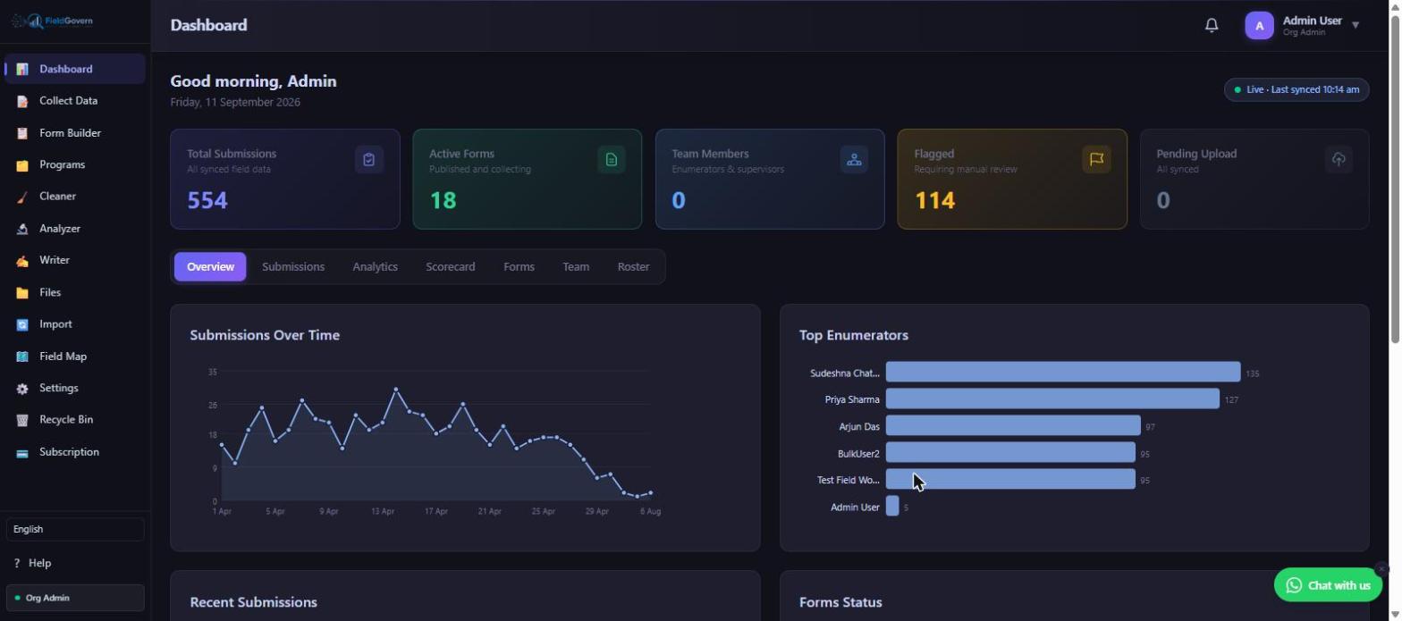
Notice what's deliberately absent from that starter list: demographic breakdowns, cross-tabs by district, comparisons against last year's baseline. Those are real and valuable, but they belong in a periodic analysis pass (built in a tool like Analyzer, on a cadence of once a round or once a month), not in a live dashboard someone glances at daily. Putting them on the daily dashboard means either they go stale fastest, because nobody has bandwidth to keep forty tiles current, or the dashboard becomes something people stop checking because it's too dense to scan in the time they actually have.
Keeping it live without an engineer
The second half of the problem — the one that kills more dashboards than poor metric selection — is the refresh cycle. A dashboard built once off a CSV export and never reconnected to the live data is a snapshot, not a dashboard, and it degrades in usefulness every day after it's built. The classic pattern at a small NGO: someone exports the collection tracker to Excel, builds a set of pivot charts, and presents it at a board meeting. Three weeks later, the same charts are still being shown, because refreshing them means re-exporting, re-cleaning, and manually rebuilding every pivot — a task the original builder doesn't have time to repeat weekly, and nobody else knows how to do.
That's not a metrics problem, it's an architecture problem. If "keeping the dashboard live" requires a human to run a CSV export and re-pivot, the dashboard will always be at least a week behind reality, and it will get further behind as other priorities compete for that person's time. The lightweight fix is to make the dashboard read directly off synced submission data rather than off a periodically exported copy of it. When field enumerators submit offline and their devices sync automatically the moment connectivity returns, a dashboard reading straight from that synced pool updates itself continuously — no export step, no manual pivot rebuild, no dependency on one person's calendar.
This is the practical difference between "automated" and "someone did it once." A dashboard that auto-refreshes from synced submissions is automated in the sense that actually matters to a resource-constrained team: it requires zero incremental labor to stay current. A dashboard fed by a manual CSV cycle is not automated no matter how nice the charts look — it's a one-time report wearing a dashboard's clothes, and it will quietly stop being trustworthy the first week the exporter is on leave.
Vanity metrics versus decision-useful metrics
Even within the short list of metrics worth showing, there's a trap: some numbers look impressive without being actionable, and a dashboard optimized for looking good in a board deck is a different thing from a dashboard optimized for triggering the right decision that week.
"We've collected 12,400 submissions this quarter" is a satisfying number to put in a slide, but on its own it tells a program manager almost nothing about whether this week needs attention. A cumulative total climbs steadily by definition — it can look healthy right up until the week a whole district stops submitting, because the historical total still dwarfs one bad week's shortfall. It's a lagging, comfort-giving number, not a decision trigger.
Contrast that with flagged-submission rate this week. If the flagged rate jumps from a baseline of 4% to 15% for one enumerator, that's a number small enough to be immediately visible, specific enough to point at one person or one site, and urgent enough to justify a same-day phone call rather than waiting for the end-of-round review. That's the actual test for whether a metric belongs on a live weekly dashboard: does crossing some threshold on this number change what someone does today, or does it just accumulate as a nice-looking historical figure.
A short, practical filter for any metric you're considering adding to a dashboard:
The build-it-once trap
There's a related failure pattern worth naming separately, because it looks like success right up until it isn't: the dashboard that gets built beautifully once, for a specific board meeting or donor site visit, and then never touched again. A consultant or a tech-savvy volunteer spends a focused week building an impressive-looking dashboard with charts, filters, and a polished layout — and because it was built as a one-off project rather than a standing piece of infrastructure, nobody on the regular team knows how the underlying queries or pivot logic work. When the data needs to be refreshed three months later, the option is either paying the same consultant again or watching the dashboard quietly become a static artifact from a specific point in time, shown occasionally with an unspoken understanding that "the numbers are from March."
The lesson isn't to avoid outside help — a well-built one-time dashboard is genuinely useful for a specific presentation. It's to be clear-eyed about the difference between a presentation asset and living infrastructure, and to make sure the metrics a program actually needs to monitor week to week live in the second category, not the first. That almost always means choosing a platform where the dashboard is a built-in, auto-refreshing feature of the same system used to collect the data, rather than a bespoke analytics layer built on top of a data export — because the export step is exactly where the one-time-build trap gets set.
Getting a first dashboard running in a week, not a quarter
For a program that has never had a working dashboard, the practical path to a first version doesn't need to be a multi-month project. A realistic sequence: in the first two or three days, get every active enumerator submitting through a single, consistent data collection system rather than a mix of paper forms, WhatsApp photos, and ad hoc spreadsheets — dashboards can only be as live as the underlying data pipeline, and a mixed-collection setup guarantees a manual reconciliation step no dashboard can automate away. By the end of the first week, confirm the five core tiles are populating correctly against a small test batch of real submissions, and walk the program manager through reading them once, so the habit of a Monday morning glance starts immediately rather than three months later after the novelty of "we have a dashboard now" has worn off. The goal for week one isn't polish — it's a live, trustworthy feed behind a small number of tiles, with the deeper analysis layered in afterward once that foundation is solid.
What a lean M&E cell should actually build, in order
For a program without a dedicated data analyst, the sequence that works best in practice is: first, get the five core tiles (submissions, active forms, team, flagged rate, pending backlog) live and auto-refreshing off synced data, with zero manual steps. Second, add the submissions-over-time trend chart and an enumerator-level leaderboard — both cheap to maintain once the feed is live, and both point directly at the two most common field problems (falling behind pace, and one enumerator underperforming or over-flagging). Third, and only after the first two are solid and trusted, layer in periodic deeper analysis — district cross-tabs, demographic breakdowns, comparisons to prior rounds — as a monthly Analyzer pass rather than a daily dashboard tile, because that level of detail genuinely needs a human to interpret it, and forcing it onto a live dashboard just means it gets ignored or goes stale.
This order matters because it front-loads the metrics that are both easiest to automate and most likely to catch a problem while it's still small. A district that's fallen behind submission pace, or an enumerator with a spiking flagged rate, is a fixable problem in week one and a much bigger cleanup job by the time a quarterly review catches it. The whole point of a live dashboard for a resource-constrained team is catching those problems early, cheaply, without needing anyone on staff whose job is to watch the data.
A dashboard that stays live on its own
FieldGovern's dashboard reads directly off synced field submissions — no CSV exports, no manual pivot rebuilds, no data team required.
Start Free Trial